Cards
Present links and highlights as cards, and arrange them in a responsive grid.
A <Card> groups a title, an optional icon or image, and a short body. Wrap
several in a <CardGroup> to lay them out in a responsive grid.
Create a project and preview it locally in under a minute.
<Card title="Quickstart" icon="rocket">Create a project and preview it locally in under a minute.</Card>
Linking a card
A card body is not a link. Setting href on a <Card> does nothing. To make a
card navigate, pass cta={{ label, href }}: it renders a single "label ›" link
below the body.
<Card title="Quickstart" icon="rocket" cta={{ label: "Read the guide", href: "/quickstart" }}>Create a project and preview it locally in under a minute.</Card>
Horizontal cards
Set horizontal to place the icon beside the text instead of above it. This
works well for denser lists.
<Card title="Command-line interface" icon="terminal" horizontal cta={{ label: "CLI reference", href: "/development" }}>Scaffold, preview, and validate your docs from the terminal.</Card>
Image cards
Pass img to show an image at the top of the card. Use imgAlt to describe it.
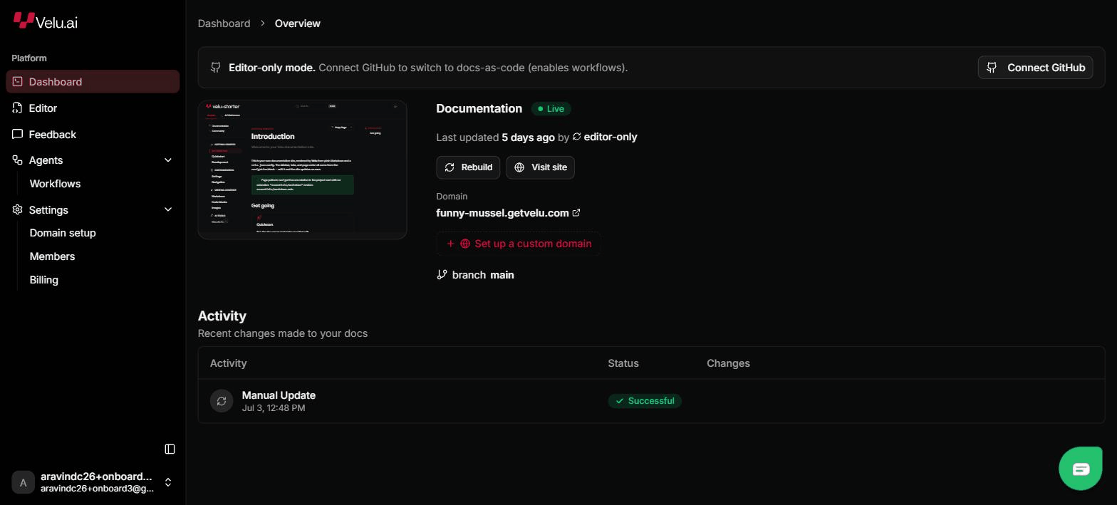
Check deployment status, project activity, and domain settings at a glance.
<Card title="Publishing" img="/images/dashboard/overview.png" imgAlt="Velu dashboard showing deployment status" cta={{ label: "Publishing guide", href: "/deploy/publishing" }}>Check deployment status, project activity, and domain settings at a glance.</Card>
Card groups
<CardGroup> arranges cards in a grid. By default it fits up to three per row
and stacks them vertically when a card would fall below its minimum width.
<CardGroup><Card title="Callouts" icon="message-circle" cta={{ label: "Callouts", href: "/components/callouts" }}>Highlighted asides and warnings.</Card><Card title="Steps" icon="list-ordered" cta={{ label: "Steps", href: "/components/steps" }}>Numbered procedures.</Card><Card title="Columns" icon="columns-3" cta={{ label: "Columns", href: "/components/columns" }}>Responsive columns for any children.</Card></CardGroup>
Card properties
The card's heading.
A Lucide icon id shown above the title (or beside
it when horizontal is set).
Lay the card out horizontally, with the icon beside the text.
An image URL shown at the top of the card.
Alternative text for img.
A { label, href } pair that renders the card's only link. Without it, the
card does not navigate.
CardGroup properties
The maximum number of cards per row.
The gap between cards, as a CSS length.
The minimum width a card may shrink to before the group wraps to fewer per row.