Themes
Choose a visual preset, set accent colors and fonts, and control light and dark mode.
Velu ships with a light and a dark appearance. You control the look with
theme, colors, and font in velu.json. Readers switch between light and
dark with the theme control in the header.
Available themes
Click any card to open a live preview. Each preview uses the Velu docs content so you can compare navigation, typography, color, and layout across themes.







Visual preset
theme selects the layout chrome. Omit it (or set "velu") for the default
Velu look.
{ "theme": "velu" }
Vepa preset
Set "theme": "vepa" for a denser header, sidebar, and table of contents.
{"theme": "vepa","colors": { "primary": "#808E02", "light": "#B2C600", "dark": "#6A7502" }}
Live preview: https://vepa.veludocs.dev
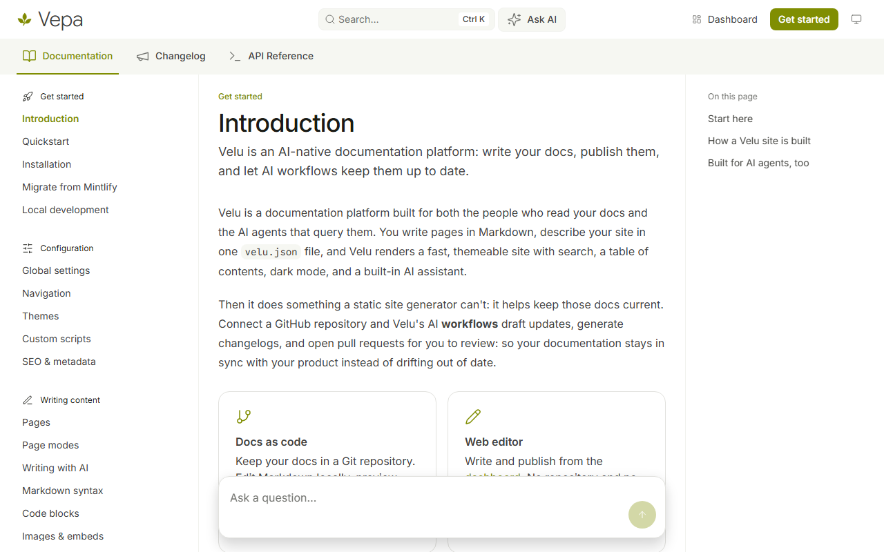
For Vepa, colors.primary is the light-mode accent and colors.light is the
dark-mode accent. The default font is Inter unless you set font.family.
Thulir preset
Set "theme": "thulir" for a fresh, open layout with Inter typography and a
compact previous/next footer.
{"theme": "thulir","colors": {"primary": "#16A34A","light": "#07C983","dark": "#15803D"}}
Live preview: https://thulir.veludocs.dev
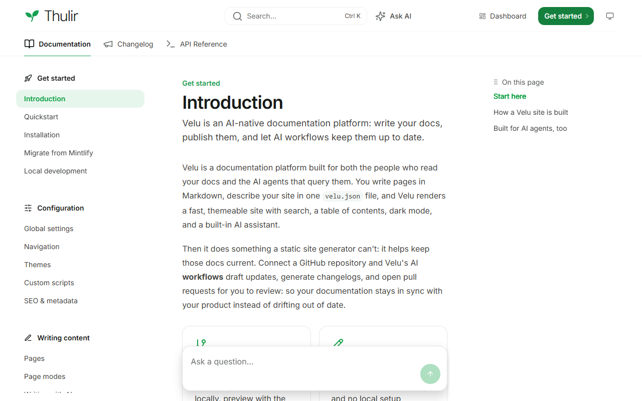
For Thulir, colors.primary is the light-mode accent, colors.light is the
dark-mode accent, and colors.dark tints the header button. The default font is
Inter unless you set font.family. The name means a fresh sprout in Tamil.
Aalam preset
Set "theme": "aalam" for branding, search, and navigation in the left sidebar,
with tabs above the article.
{"theme": "aalam","colors": {"primary": "#9A3412","light": "#EA580C","dark": "#9A3412"}}
Live preview: https://aalam.veludocs.dev
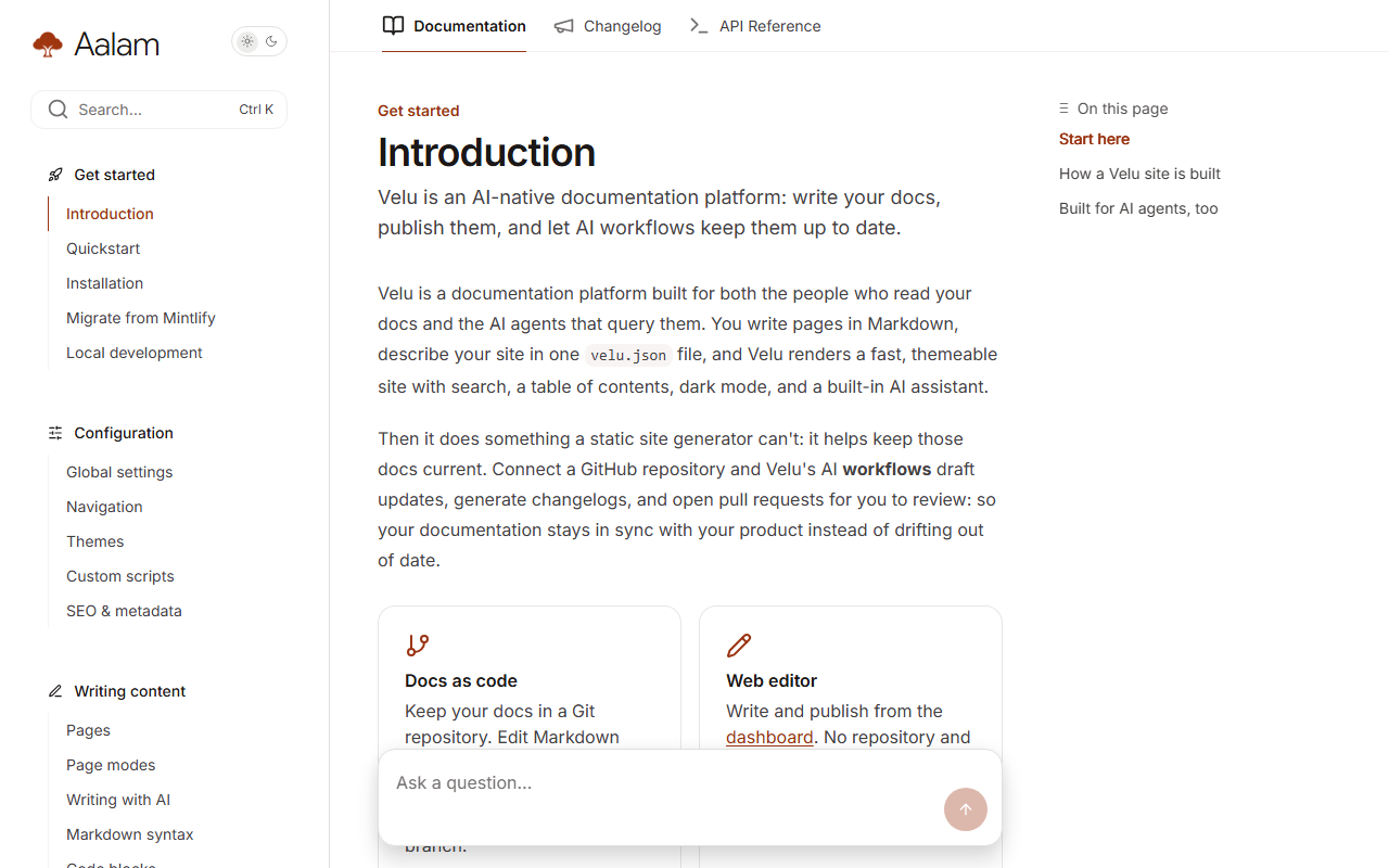
For Aalam, colors.primary is the light-mode accent, colors.light is the
dark-mode accent, and colors.dark tints header buttons. The default font is
Inter unless you set font.family. The name means banyan in Tamil.
Nila preset
Set "theme": "nila" for a compact header, grouped sidebar, and a focused
reading column.
{"theme": "nila","colors": {"primary": "#D69000","light": "#D69000","dark": "#D69000"}}
Live preview: https://nila.veludocs.dev
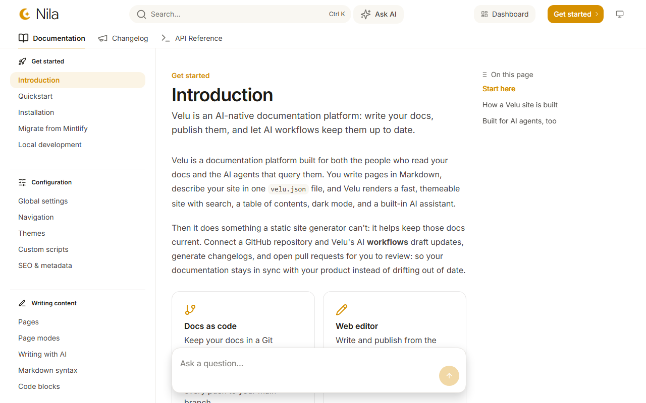
For Nila, colors.primary is the light-mode accent, colors.light is the
dark-mode accent, and colors.dark tints header buttons. The default font is
Inter unless you set font.family. The name means moon in Tamil.
Kadhir preset
Set "theme": "kadhir" for a clean, minimal reading experience with generous
whitespace, a 248px sidebar rail, and centered article column. Good for guides
and tutorials that readers skim before diving deeper.
{"theme": "kadhir","colors": {"primary": "#FF7819","light": "#FF9A5C","dark": "#FF7819"}}
Live preview: https://kadhir.veludocs.dev
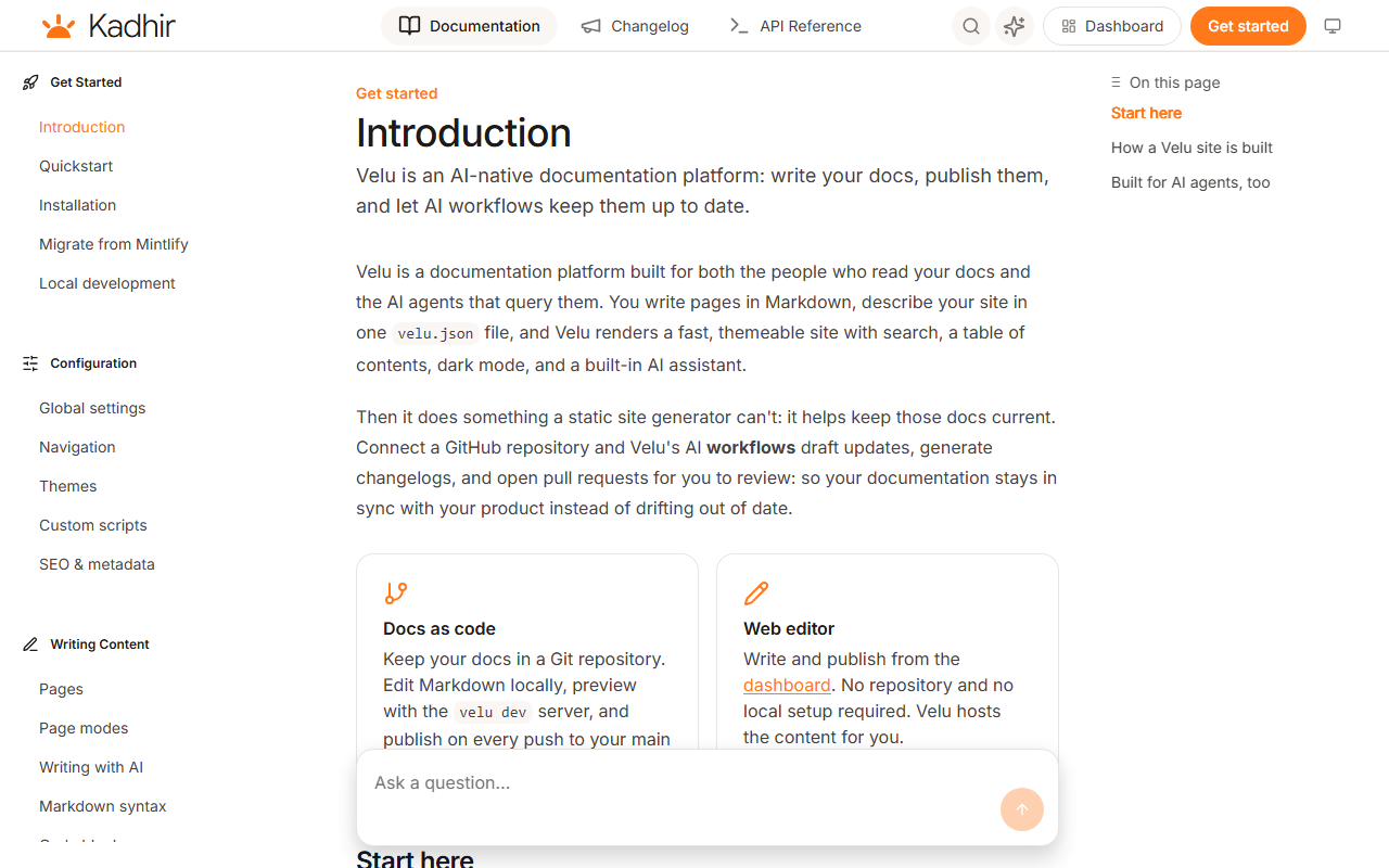
For Kadhir, colors.primary is the light-mode accent, colors.light is the
dark-mode accent, and colors.dark tints header buttons. The default font is
Inter unless you set font.family. The name means sun in Tamil.
The visual preset is separate from the reader's Light / Dark / System preference.
Light and dark mode
Every site supports both themes. On a reader's first visit, Velu follows their operating system preference.
Dark mode is on by default and always available. There is no config to turn it off or to lock the site to a single theme.
Because the theme persists per browser, the toggle you see while previewing
may differ from a first-time visitor's. Clear the velu-theme key or open a
private window to see the OS-driven default.
Colors
colors.primary is the accent used across the interface: links, active
navigation items, and buttons. It defaults to #dc143c.
{ "colors": { "primary": "#dc143c" } }
Per-theme accents
A single accent can look too dark on a dark background or too light on a light
one. Add light and dark to set the accent for each theme; either one falls
back to primary when omitted.
{"colors": {"primary": "#dc143c","light": "#f26b83","dark": "#b3102f"}}
Here light is used when the reader is in light mode and dark when they're in
dark mode.
Font
font.family is any Google Font family name. Velu
loads the font automatically and applies it as the body font: you don't add a
stylesheet or a script.
{ "font": { "family": "Inter" } }
Use the exact family name as it appears on Google Fonts, for example "Roboto Mono" or "IBM Plex Sans".
Beyond colors and fonts
When colors and font aren't enough, add a .css file to your project. Velu
includes it on every page, after its own styles, so your rules win. The same
goes for .js files. See Custom scripts
for the stable selectors you can target and how scripts are loaded.
See Global settings for the full velu.json
reference, including the logo and favicon that sit alongside these theme fields.